Feature Updates 01/06/2026
A Smarter, More Confident Way to Give
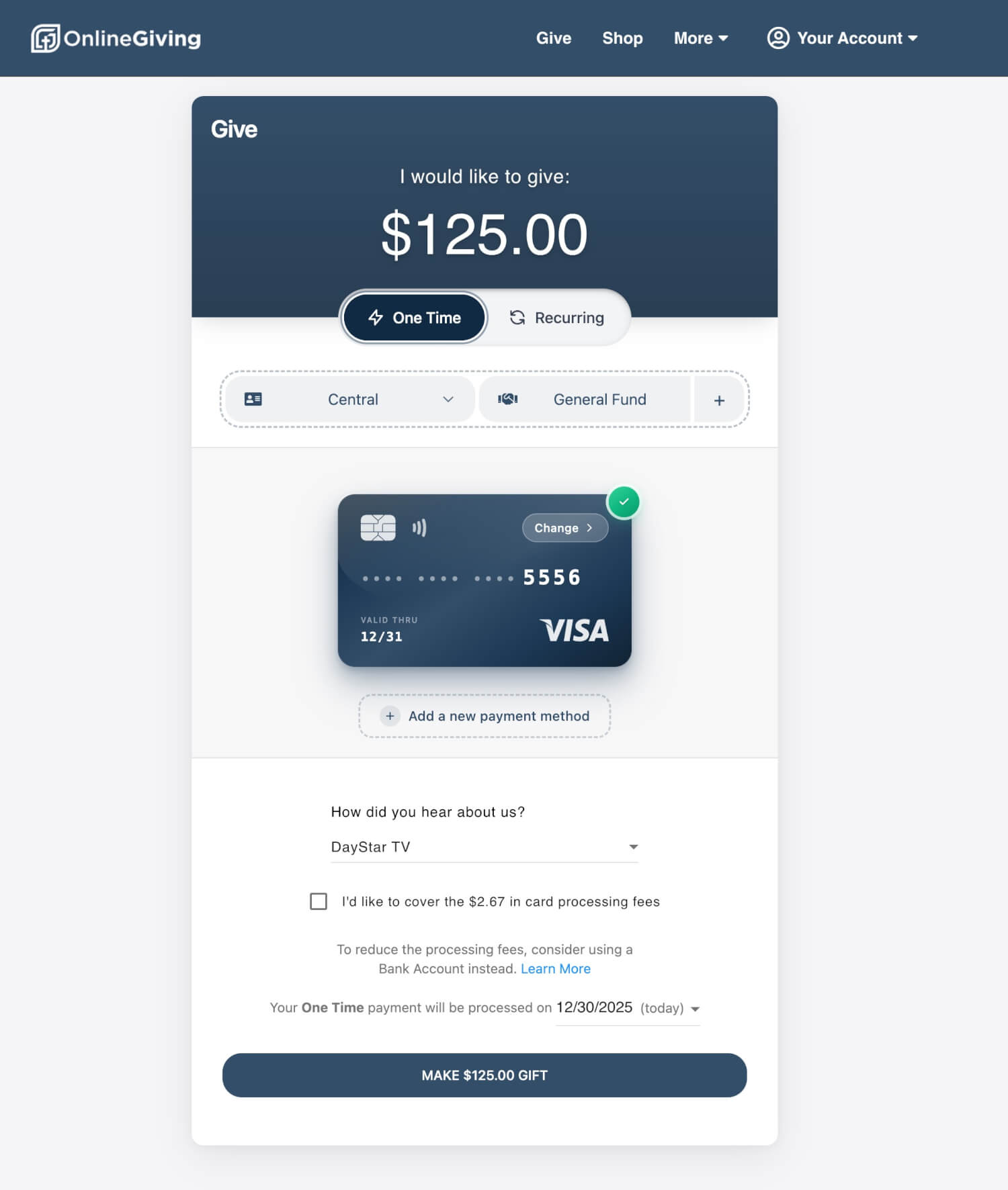
New Payment Experience Live as of January 2, 2026
We’re pleased to announce a fresh new payment experience across giving and checkout—thoughtfully redesigned using modern, time-tested 2026 UI/UX standards and informed by real donor behavior.
This update enhances how donors choose payment methods, enter payment details, and complete transactions—making the experience feel clearer, more intuitive, and more trustworthy from start to finish.
What’s New
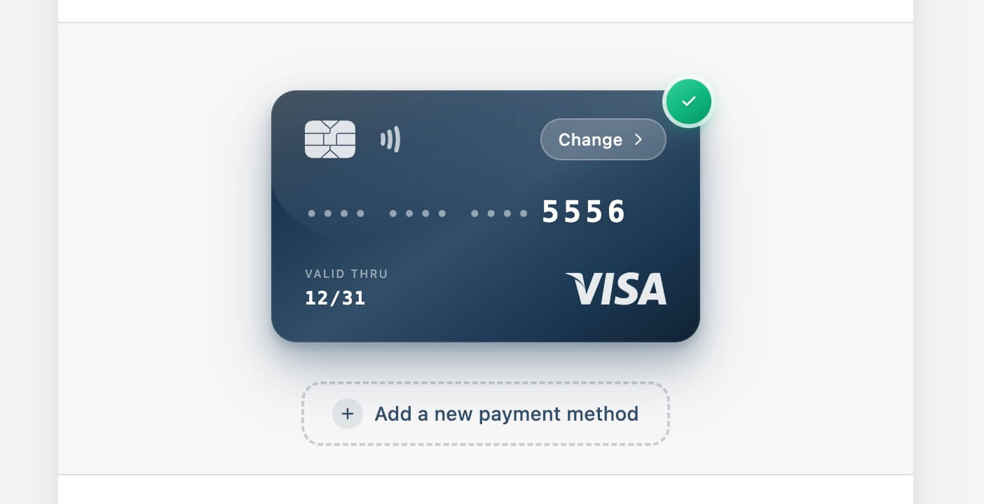
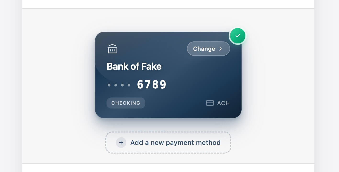
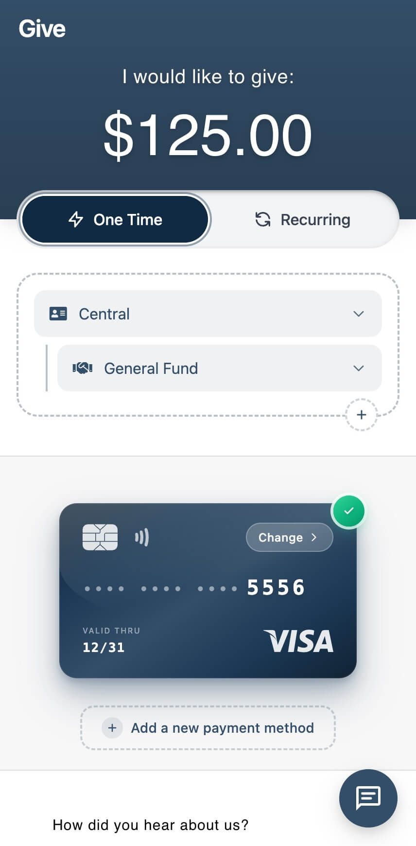
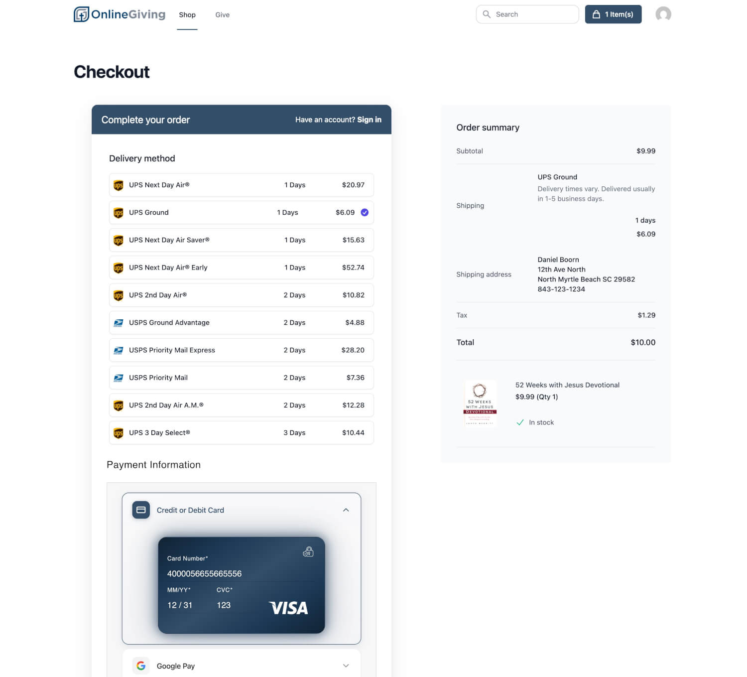
Realistic, Reassuring Payment Entry
Our updated card and bank entry experience builds on our proven premium foundation, now refined even further with:
-
Highly realistic saved payment cards that mirror familiar, physical cards
-
Smooth animated progress cues that guide donors through each step
-
Authentic visual depth and hierarchy for cards, bank accounts, and ACH entries
-
A cleaner, calmer layout that reduces hesitation during sensitive data entry
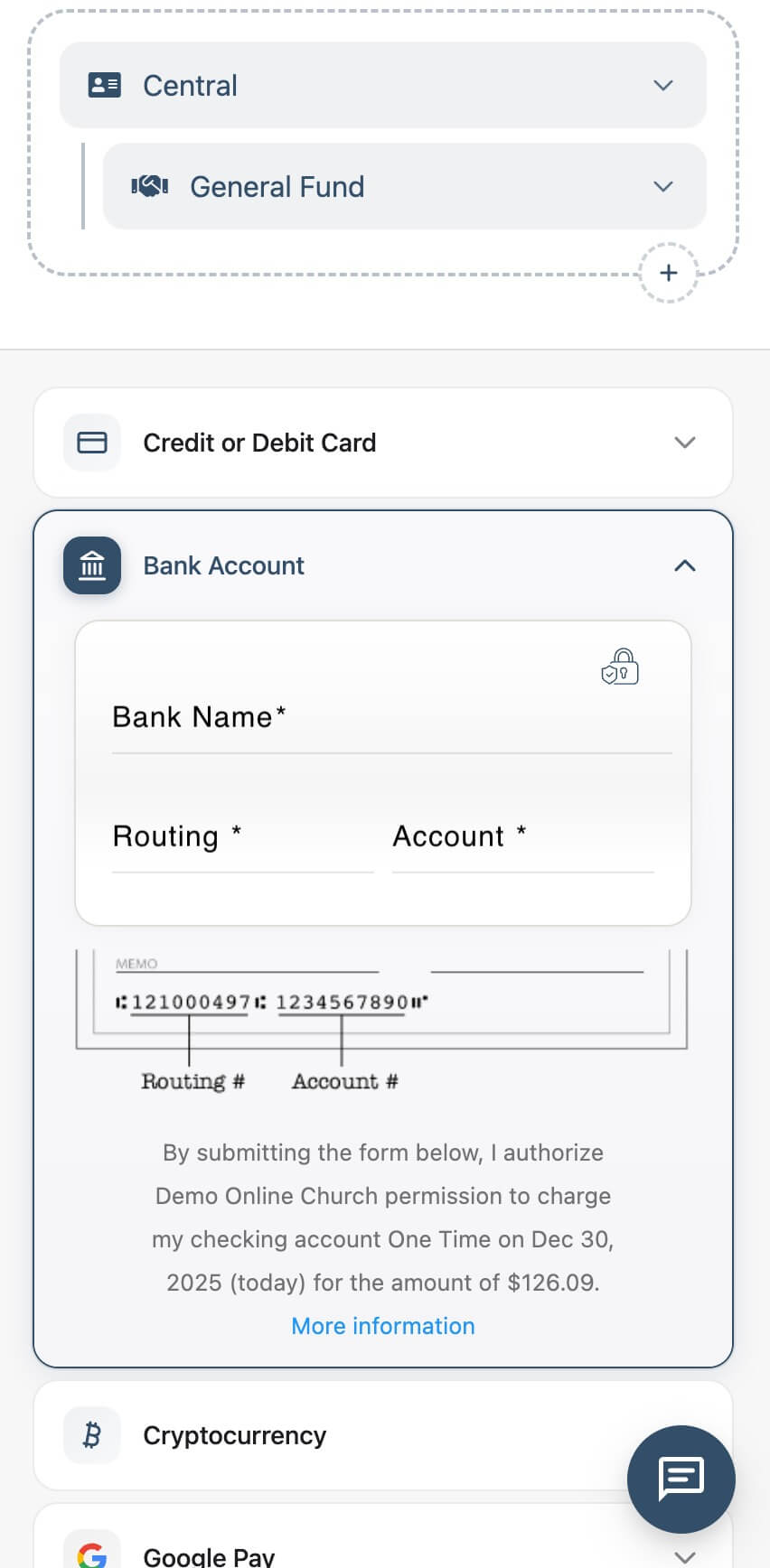
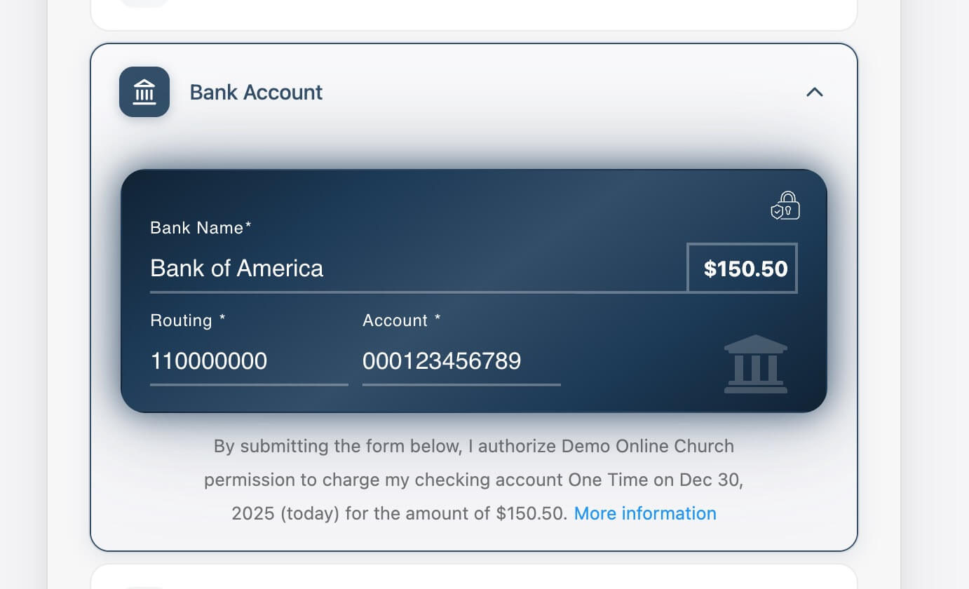
For bank account entry, donors benefit from a clearer check-style layout that visually connects routing and account numbers to their real-world equivalents—making ACH entry more approachable and easier to understand.
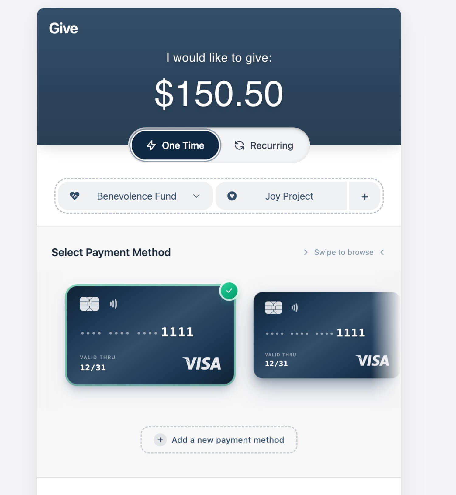
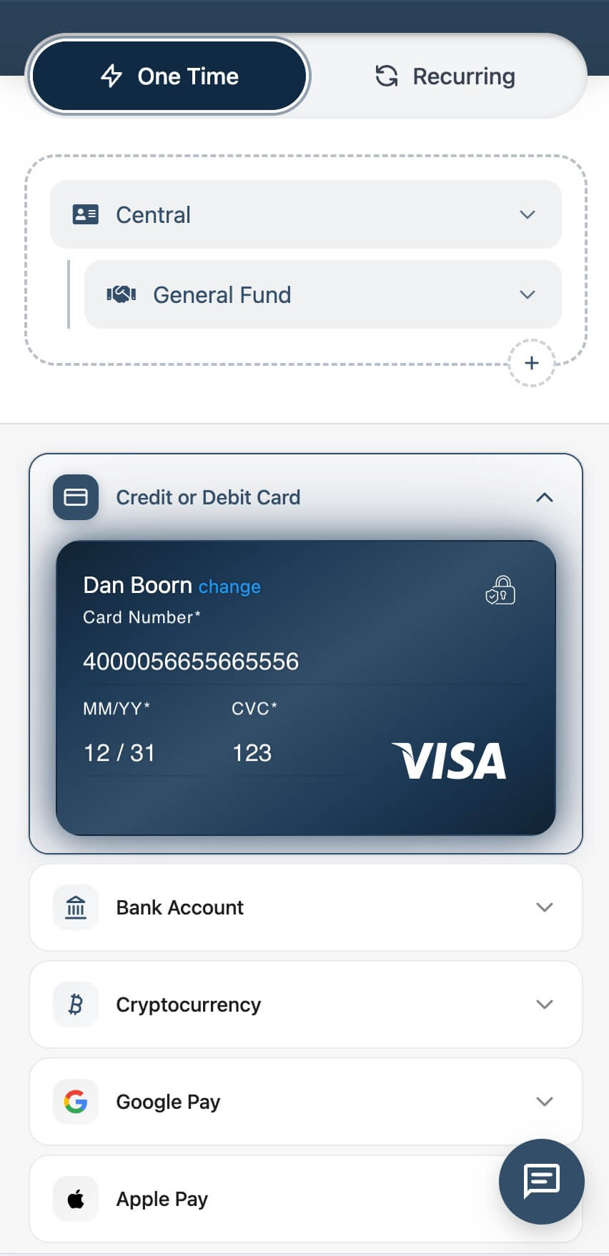
A Modern Vertical Payment Method Picker
We’ve reimagined how donors select how they give.
Instead of horizontal tabs and visually disconnected wallet buttons, the new vertical payment method picker creates a unified, consistent experience across:
-
Credit & debit cards
-
Bank accounts (ACH)
-
Cryptocurrency
-
Google Pay and Apple Pay
Each payment type now lives within the same visual and interaction system, improving scanability, reducing cognitive load, and creating a more cohesive experience—especially on mobile.
Automatically Themed Payment Entry
All payment entry experiences are now automatically color themed, adapting seamlessly to the surrounding interface and selected payment method.
Cards, bank accounts, and payment containers dynamically inherit brand and surface colors to create:
-
A more cohesive, immersive checkout experience
-
Clear visual separation without harsh contrasts
-
Consistent theming across giving and checkout flows
This subtle theming helps payment entry feel native to the experience rather than overlaid—reinforcing clarity, trust, and visual continuity without requiring manual configuration.
Consistency Across Giving and Checkout
These enhancements aren’t limited to one flow. The same payment system now powers:
-
Giving experiences
-
Shopping and product checkout
-
Saved payment selection and management
This consistency helps users move between experiences with confidence, reinforcing familiarity and reducing friction over time.
Why This Matters
These updates aren’t about flash—they’re about trust, clarity, and momentum.
By combining realistic visuals, clear structure, and modern interaction patterns, the new payment experience:
-
Helps donors move through checkout with less uncertainty
-
Makes complex payment options feel approachable
-
Raises the overall quality and polish of the giving experience
The result is a flow that feels intentional, modern, and quietly confident.
Now Live
These enhancements went live on January 2, 2026, and are already improving the donor and checkout experience across the platform.
This update doesn’t just refine what existed—it meaningfully raises the bar for how giving-focused payment experiences should look, feel, and function.
 |
 |
 |
 |
 |
 |
 |
 |
 |
 |