Feature Updates 01/13/2026
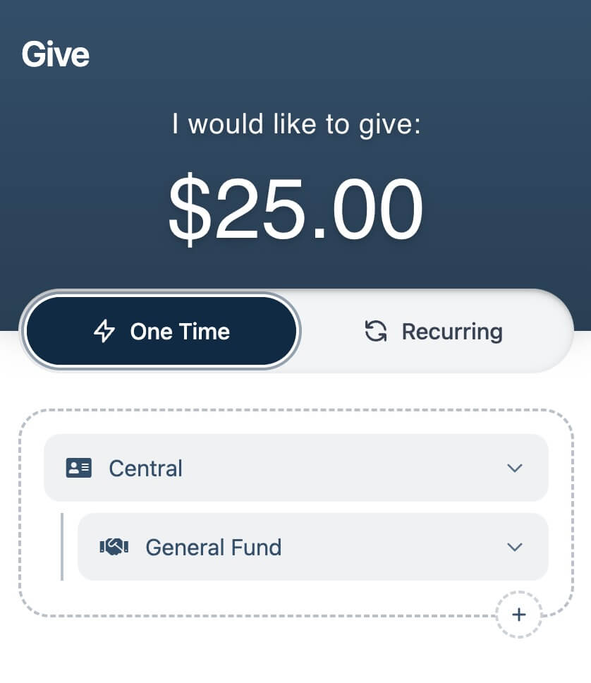
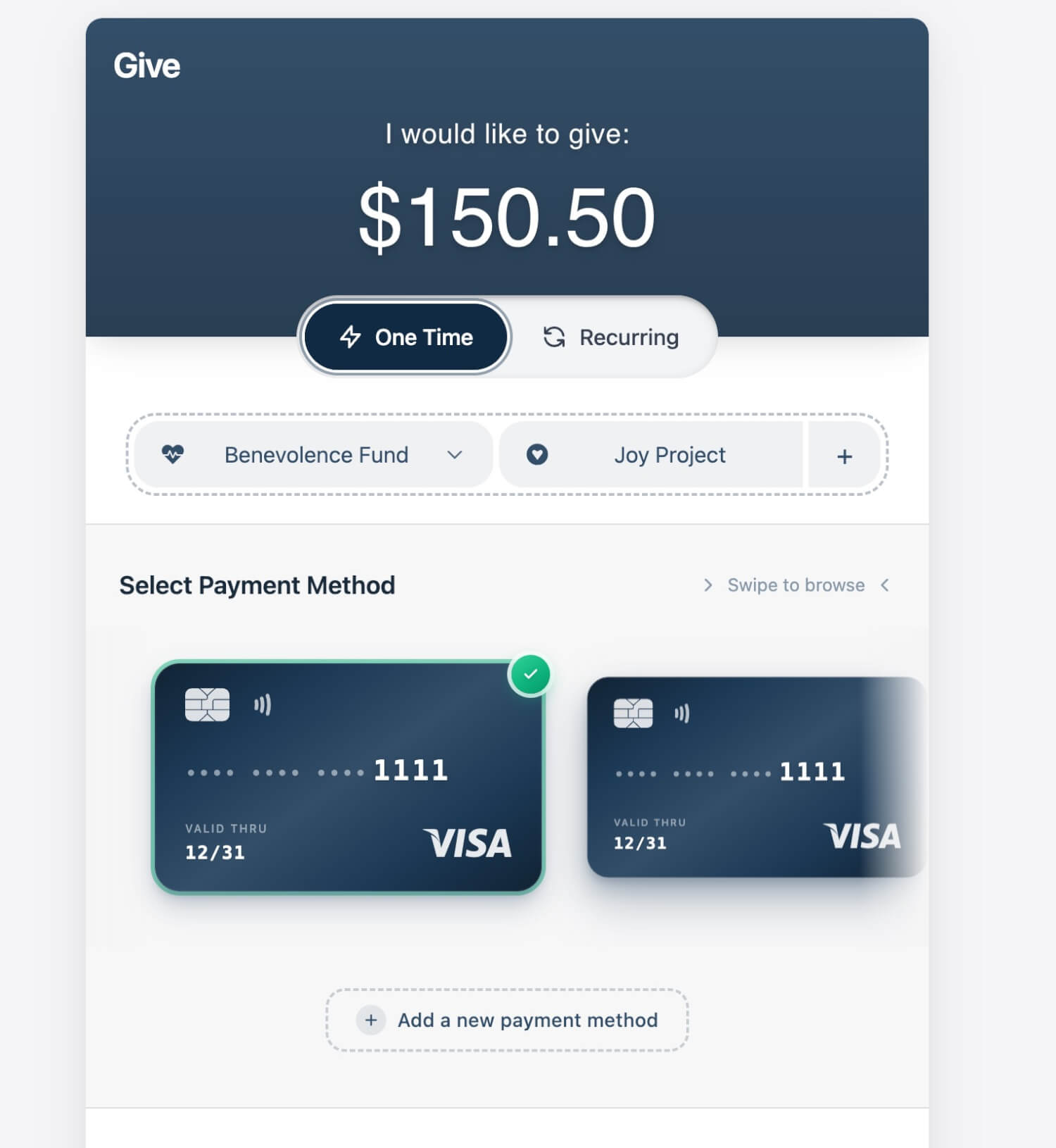
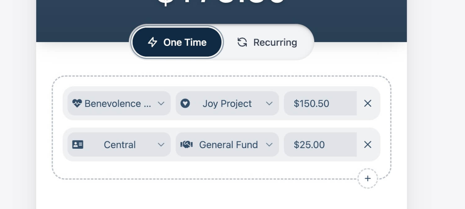
A Lighter, More Focused Fund Picker
We’ve refreshed the Fund Picker with a cleaner, lighter UI that helps givers stay focused—while preserving the flexibility churches depend on.
A Lighter, Smarter Theme
The updated design automatically adapts to each church’s existing color settings, using HSL-based theming to create a lighter, more balanced look. Funds remain clearly defined and on-brand, but with less visual weight than before.
Same Power, Clearer Presentation
The Fund Picker continues to support all existing giving scenarios, including:
-
Campus and fund combinations
-
Primary funds with sub-funds
-
Multiple line items within a single gift
These options are now easier to scan and understand, with improved spacing and hierarchy across mobile and desktop.
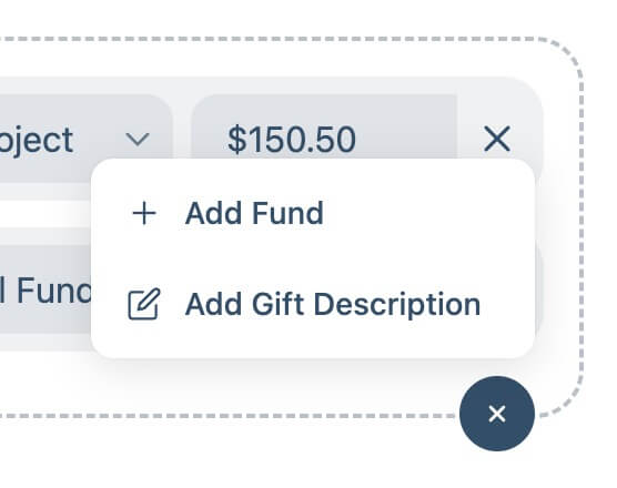
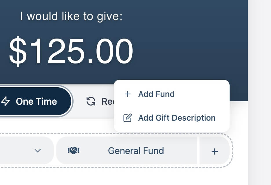
A Simpler Way to Add More
Secondary actions have been streamlined into a single, thoughtfully designed plus button. Adding another fund or including a gift description feels intentional and out of the way—available when needed, unobtrusive when not.
-
Gift descriptions still follow existing church settings
-
No configuration or action is required
Designed to Feel Effortless
Subtle animations and a reduced visual footprint keep the form feeling light and responsive. The result is a giving experience that feels clearer and more natural—without changing how churches or givers interact with it.