Feature Updates 02/24/2026
Campus-Level Giving Health at Your Fingertips: The Campus Generosity Snapshot
What’s New
Campus pastors and leaders can now see their campus’s generosity health in vivid detail. A dedicated, campus-scoped dashboard with its own health score, AI executive summary, and automated email delivery. No more filtering org-wide reports—this is YOUR campus, YOUR data, YOUR insights.
 |
 |
|
Where to Find It
Path: Admin > Giving > Reports, then the Campus Generosity Snapshot card
Who can use it: Any administrator with Donor Admin role.
How to open: Click the Campus Generosity Snapshot card, choose your campus from the dropdown, and click View Report.
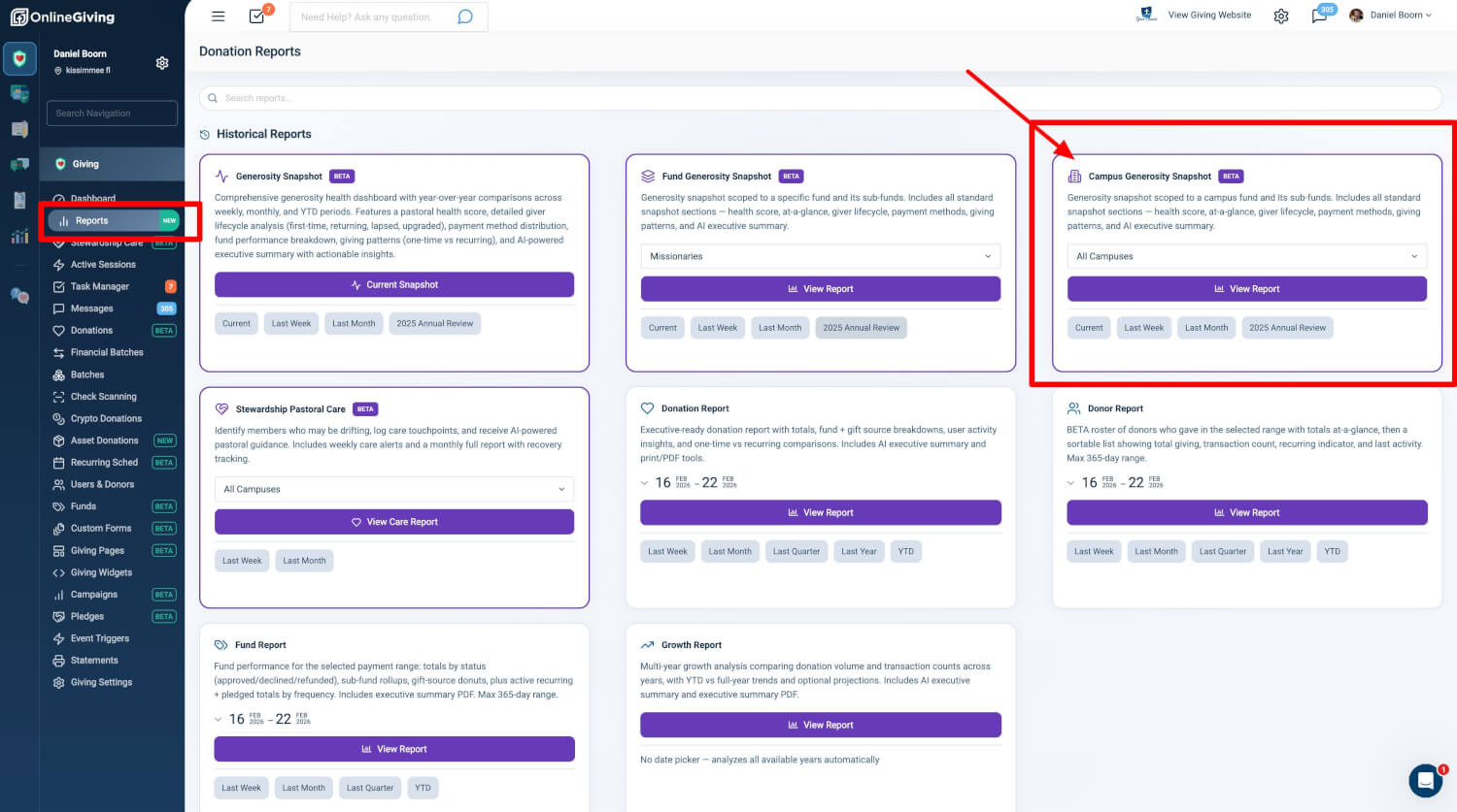
Reports Hub Integration
The Campus Generosity Snapshot appears as a dedicated card in the Donation Reports Hub under "Historical Reports."
| Element | Description |
|---|---|
| Campus Selector | Dropdown with all campus funds plus "All Campuses" option |
| View Report | Opens the campus-scoped snapshot for the selected campus and period |
| Quick Period Links | Current, Last Week, Last Month, Annual Review—each preserves your campus context |
Why it matters: Multi-campus leaders get one-click access to campus-level giving health without navigating multiple reports. The hub keeps campus context intact when you switch time periods.
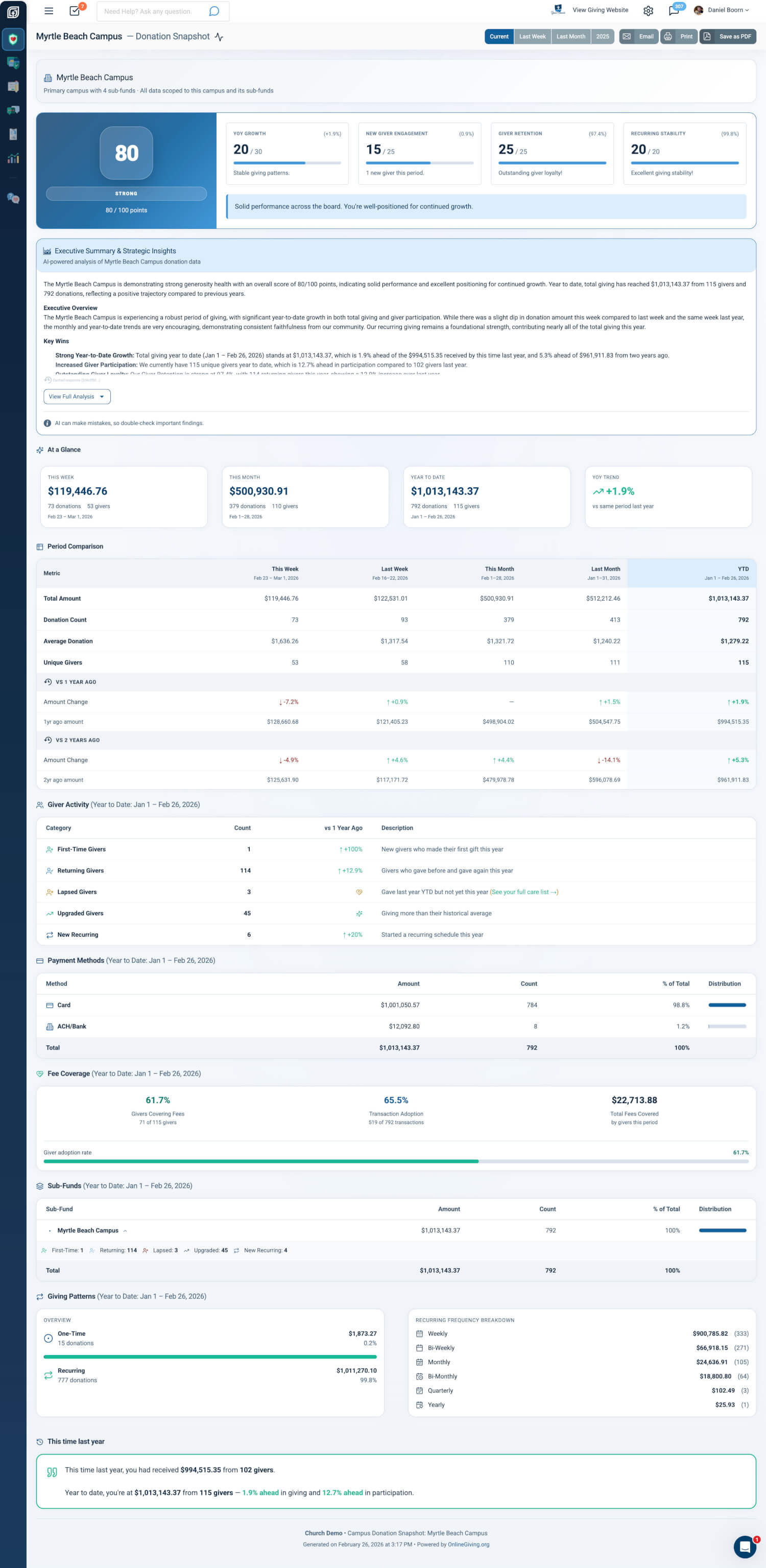
Report Dashboard
The report loads with full campus context. The page is a richly detailed, scroll-through report composed of modular sections.
Page Header & Navigation
| Element | Description |
|---|---|
| Breadcrumb | Home > Reports > Snapshot > Campus Name (or "All Campuses"), with period appended when not "Current" |
| Period Switcher | Button group: Current, Last Week, Last Month, Annual Review; all links preserve your campus |
| Action Buttons | Email (opens settings modal), Print (browser print), Save as PDF |
Campus Context Banner
A gradient-accented banner at the top provides immediate context:
- Single Campus — Campus name with building icon, sub-fund count, and note that data is scoped to this campus and its sub-funds
- All Campuses — "All Campuses" with note that data includes all campus funds combined and excludes non-campus funds
Why it matters: Campus leaders can quickly identify which campus or aggregate view they are viewing. Exported PDFs carry professional branding for sharing with leadership teams.
Report Sections
The report comprises 10 sections, each available in web view, email, and PDF.
1. Generosity Health Score
A premium panel displaying an overall health score (0–100) with pastoral, encouraging messaging.
| Element | Description |
|---|---|
| Score Display | Large numeric score in gradient badge; desktop split-panel, mobile stacked |
| Status Badge | Thriving, Strong, Healthy, Building, Developing, Starting—with status-specific color theming |
| Contributing Factors | Up to four scored factors (e.g., Recurring Giving, Active Givers, YoY Growth, Avg Gift) with progress bars and insight text |
| Encouragement Message | Context-aware pastoral message in a light-background callout |
| Data Maturity | "Building history" for newer orgs; simplified view with early wins badges for brand-new orgs |
Why it matters: A single composite score with contributing factors helps leaders quickly assess campus giving health and identify which levers to focus on, without interpreting raw metrics.
2. AI Executive Summary
AI-powered insights that explain what the numbers mean. The system reads your report data and generates a strategic executive summary.
| Aspect | Description |
|---|---|
| Campus-Aware | Single campus: scoped to your campus and its sub-funds; All campuses: scoped to all campus funds combined |
| Period-Aware | Different insights for Current, Last Week, Last Month, Annual Review |
| Output | Executive Overview, Key Wins, Watch Items, Period Comparison, Giver Lifecycle Highlights, Fee Coverage |
| Display | Collapsible; content capped with "View Full Analysis / Collapse Analysis" toggle |
Why it matters: Raw metrics require interpretation. The AI summary transforms dozens of data points into actionable strategic intelligence, reducing decision paralysis for campus and executive leadership.
3. At a Glance
Summary metric cards providing a quick overview. Card content changes by period focus:
| Period Focus | Card 1 | Card 2 | Card 3 | Trend Card |
|---|---|---|---|---|
| Current | This Week | This Month | Year to Date | YoY vs same period last year |
| Last Week | Last Week | Week Before | Last Month | WoW vs week before |
| Last Month | Last Month | Month Before | Year to Date | MoM vs same month last year |
| Last Year | Full Year | 2 Years Ago | 3 Years Ago | YoY vs previous year |
Each card shows period label, date range, total amount, transaction count, and giver count. The trend card shows directional icon with percentage change and color coding (teal positive, red negative).
4. Period Comparison Table
Side-by-side comparison table with dynamic columns based on period focus. Each column shows total amount, transaction count, giver count, and year-over-year change indicators (colored arrows with formatted percentages).
5. Giver Lifecycle
Five lifecycle categories with counts, YoY change, and descriptions:
| Category | Description |
|---|---|
| First-Time Givers | New givers who made their first gift in the period |
| Returning Givers | Givers who gave before and gave again |
| Lapsed Givers | Gave in equivalent prior period but not current; links to Pastoral Care report |
| Upgraded Givers | Giving more than historical average; sparkles indicator |
| New Recurring | Started a new recurring schedule in the period |
Each row links to the Users list pre-filtered by lifecycle type, date range, tax-deductible status, and fund when campus-scoped.
Why it matters: Lifecycle metrics reveal acquisition, retention, and attrition patterns. Lapsed giver links enable immediate pastoral follow-up without leaving the report.
6. Payment Methods
Distribution of giving by payment method (Card, ACH/Bank, etc.) with amount, transaction count, and percentage of total.
7. Fee Coverage
When the organization uses "Cover the Fee" and has data in the period: giver adoption rate, transaction adoption rate, total fees covered, and visual progress bar. Section appears only when data exists.
8. Fund/Sub-Fund Breakdown
Single-campus: breakdown across the campus’s sub-funds. All Campuses: breakdown across all campus funds. Each fund shows total amount and transaction count.
9. Giving Patterns
Recurring vs one-time giving analysis with totals, percentages, and visual distribution comparison.
10. This Time Last Year
Year-over-year comparison panel showing the equivalent period from the previous year alongside the current period, highlighting growth or decline.
Email System
Reports are delivered automatically. Schedule weekly, monthly, or annual reports delivered right to your inbox.
Manual Send
Enter recipient emails in the Email modal and send the exact report you’re viewing (same campus, same period). Real-time success or error messaging confirms delivery.
Scheduled Delivery
| Aspect | Detail |
|---|---|
| Automatic Delivery | Reports are delivered automatically on the schedule you choose |
| Opt-In | Campus snapshots are opt-in; no emails until an administrator enables a frequency |
| Per-Campus | Each campus can have independent weekly, monthly, and annual schedules |
| Deduplication | The system tracks sent reports to avoid duplicate deliveries |
Recipient Options
| Mode | Description |
|---|---|
| All Donor Admins | Sends to every user with Donor Admin role; default when enabling a schedule |
| All Donor Admins + Customize | Add extra recipients and/or exclude specific admins |
| Custom Email List | Sends only to explicitly specified addresses |
Why it matters: Campus leaders can receive regular, campus-specific giving health reports without manual effort. Per-campus scheduling allows different campuses to have different recipient lists and frequencies.
PDF Export
| Aspect | Detail |
|---|---|
| Trigger | "Save as PDF" button in page header |
| Process | Generates a multi-page PDF (letter, portrait) with professional formatting |
| Header | Branded header with org logo, report title, period, organization name, and generation timestamp |
| Filename | Campus name and date in the filename for easy filing |
At a Glance
| What You Get | How It Helps |
|---|---|
| Reports Hub Integration | Campus Selector, View Report, Quick Period Links—one place for campus giving intelligence |
| Report Dashboard | Breadcrumb, Period Switcher, Action Buttons (Email, Print, PDF), Campus Context Banner |
| Generosity Health Score | 0–100 score, status badge, contributing factors, encouragement, data maturity awareness |
| AI Executive Summary | Campus-aware, period-aware insights; collapsible display |
| At a Glance Cards | Period-specific metric cards with trend indicators |
| Giver Lifecycle | First-Time, Returning, Lapsed, Upgraded, New Recurring with drill-down links |
| Additional Sections | Period Comparison, Payment Methods, Fee Coverage, Fund Breakdown, Giving Patterns, This Time Last Year |
| Email System | Manual send or scheduled delivery (weekly, monthly, annual); opt-in per campus; three recipient modes |
| PDF Export | Client-side generation, premium branded header, campus-scoped filename |
| Access | Donor Admin role |
Quick Start
- Go to Admin > Giving > Reports and click the Campus Generosity Snapshot card.
- Choose your campus from the dropdown (or "All Campuses") and click View Report.
- Use the Email button to send the report now or set up weekly, monthly, or annual delivery to your inbox.