Feature Updates 03/14/2026
See the Pulse of Every Relationship: The Engagement Intelligence Dashboard — Part 4 of 7
What's New
Engagement is the heartbeat of every member relationship — and this dashboard doesn't just count transactions; it reveals the rhythm, intensity, and trajectory of how deeply someone is connected. A visual calendar shows exactly when someone was active over the past year — like a heartbeat of their relationship with your church. The engagement score distills connectedness into a single, actionable number. Most powerfully: changes in engagement predict giving changes 3–6 months later. This is your early warning system — identify at-risk members before giving declines, and drill into specific activity types or time periods to understand exactly where the pulse is fading.
Where to Find It
Path: Admin > Donors & Users > click any member name > Profile tab > scroll to Engagement section
Who can use it: Any administrator with access to donor and member records.
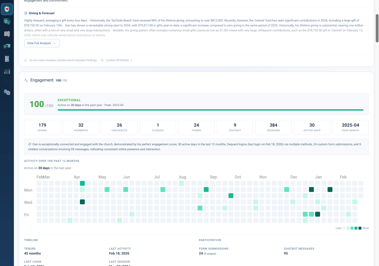
Engagement Score Hero Bar
The Engagement Score Hero Bar anchors the Engagement section with a large, color-coded score (0–100) that summarizes the member's overall connectedness.
- Score: Large numeric display (0–100) with color coding
- Color Coding: Green (70+), Amber (30–69), Red (<30)
- Label: Descriptive tier based on score range
- Detail Line: Active days in the past year, peak month
- Progress Bar: Visual fill proportional to score
Score Labels
- 90–100: Exceptional
- 70–89: Highly Engaged
- 50–69: Moderately Engaged
- 30–49: Low Engagement
- 0–29: At Risk
Why it matters: A single number allows staff to triage members quickly. Members with declining engagement scores often show giving declines 3–6 months later, making this section a leading indicator for pastoral outreach and retention efforts.
How the Score Works
The Engagement Score reflects how many ways someone connects, how often they participate, and how recently they've been active. The score rewards both breadth (how many different ways they engage — giving, forms, chatbot, and more) and depth (how often they participate), while recent activity is weighted so that members who have gone quiet are clearly distinguished from those who are still active.
Why it matters: Staff can interpret a low score as a signal to reach out before giving patterns shift. The multi-factor approach gives you a fuller picture than a simple activity count.
Engagement Metric Boxes
Nine Engagement Metric Boxes display counts for each touchpoint type. Each box appears when the member has activity in that category; most boxes are clickable and take you directly to the relevant tab.
- Giving: Lifetime gift count
- Payments: Lifetime payment count
- Checkouts: Lifetime checkout count
- Pledges: Lifetime pledge count
- Forms: Lifetime form submission count
- Chatbot: Lifetime chatbot interaction count
- Sessions: Lifetime session count
- Active Days: Distinct days with activity in past year
- Peak Month: Month with highest activity
Why it matters: Staff can see at a glance which channels a member uses and jump directly to the relevant view. The interface stays uncluttered for members with limited touchpoints.
AI Engagement Insight
When available, an AI Engagement Insight narrative appears above the Activity Heatmap. It summarizes engagement patterns in plain language, drawing from the full member context. When no AI insight is available, a fallback line displays active days and peak month.
Why it matters: The AI narrative adds interpretive context that raw numbers cannot provide, helping staff understand how a member engages, not just how much.
Activity Heatmap
The Activity Heatmap is a visual calendar showing exactly when someone was active over the past year — like a heartbeat of their relationship with your church. Each cell represents a day; color intensity indicates activity volume (gifts, payments, form submissions, chatbot conversations, pledges, and more).
- Layout: 52 weeks × 7 days, with day-of-week and month labels
- Color Scale: Light to dark gradient (Less → More)
- Click-to-Drill: Clicking a cell with activity switches to the Activity tab with a date filter applied for that day
- Tooltip: Hover shows date and breakdown by activity type
Why it matters: The heatmap reveals patterns at a glance — seasonal spikes, gaps in activity, or recent drop-offs. Click-to-drill enables staff to investigate a specific day's events without leaving the profile context.
Timeline & Participation
Two side-by-side columns provide detailed timeline and participation insights.
Timeline
- Tenure: Months since account creation
- Last Activity: Date of most recent activity across all touchpoints
- Last Login: Date of most recent login
- Last Session: Date of most recent session
- Sessions This Year: Session count for current calendar year
Participation
- Form Submissions: Lifetime count with unique form count in parentheses
- Forms This Year: Form submission count for current calendar year
- Chatbot Messages: Lifetime chatbot message count
- Chatbot This Year: Chatbot message count for current calendar year
Why it matters: Timeline and participation insights complement the engagement score with concrete dates and counts. Staff can quickly assess recency and channel mix for outreach planning.
Action Buttons
Three action buttons provide quick navigation to embedded operational views.
- View Activity: Go to Activity tab
- View Forms: Go to Form Submissions tab (when member has form submissions)
- View Conversations: Go to Chatbot Conversations tab (when member has chatbot activity)
Why it matters: One-click access reduces friction when staff want to review specific activity types after reviewing the engagement summary.
Quick Start
- Go to Admin > Donors & Users, then click any member name.
- Open the Profile tab and scroll to the Engagement section.
- Check the score and heatmap first — then use the metric boxes and action buttons to drill into specific activity.
At a Glance
- Engagement Score Hero Bar: A single 0–100 number with color coding and labels (Exceptional, Highly Engaged, Moderately Engaged, Low Engagement, At Risk) — triage members quickly and spot declines before giving drops
- Score Calculation: Reflects how many ways someone connects, how often they participate, and how recently they've been active — a fuller picture than a simple count
- Engagement Metric Boxes: Nine clickable boxes for Giving, Payments, Checkouts, Pledges, Forms, Chatbot, Sessions, Active Days, Peak Month — jump straight to the relevant view
- AI Engagement Insight: Narrative summary above the heatmap when available — understand how members engage, not just how much
- Activity Heatmap: Visual calendar of the past year — spot seasonal spikes, gaps, and drop-offs at a glance; click any day to drill in
- Timeline & Participation: Tenure, last activity, last login, sessions, form submissions, chatbot messages — concrete dates and counts for outreach planning
- Action Buttons: View Activity, View Forms, View Conversations — one-click access to detailed views