Feature Updates 03/19/2026
Know Who Showed Up This Sunday: The New Attendance Check-In Report
This report is part of the Text Messaging Reports suite. Explore all eight reports from Text Marketing > Reports in your control panel.
What’s New
How many people checked in by text this Sunday? What about last month? Is midweek attendance growing or slipping? Are the same faces showing up week after week — or are you seeing a steady stream of first-timers?
Until now, getting a clear picture of text-based attendance meant counting conversations by hand, scrolling through chatbot logs, or simply relying on a headcount from your greeters. You knew people were texting in, but you had no easy way to spot trends, compare days of the week, or see which services are drawing the most check-ins.
That ends today.
The new Attendance Check-In Report turns every text-based check-in into a clear, visual story. Open one page and you instantly see how many people checked in, which day is your peak, who’s returning week after week, and who walked through your doors for the very first time. An AI-powered insights panel reads the data for you and highlights what matters most — so you spend less time analyzing numbers and more time caring for the people behind them.
Where to Find It
Attendance Check-In is in your control panel at:
Text Marketing > Reports > Attendance Check-In
Any administrator with Giving Admin or Text Marketing Admin access can use this report. Just click Reports under Text Marketing in your left sidebar, then click the Attendance Check-In card and choose your date range.
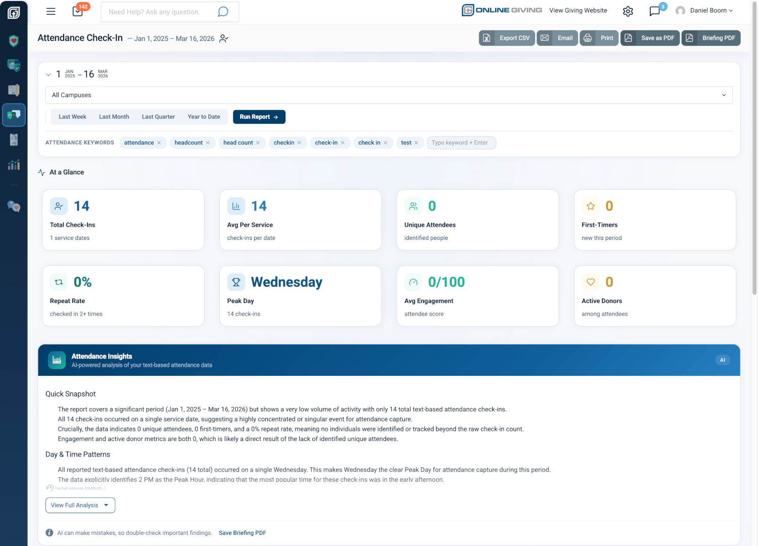
Your Attendance Story at a Glance
The moment you open the report, eight snapshot cards give you the full picture of your text-based attendance in seconds. You see Total Check-Ins, Average Per Service, Unique Attendees, First-Timers, Repeat Rate, and your Peak Day — all for whatever date range you choose. If engagement and giving data is available for your attendees, you’ll also see their Average Engagement Score and how many are Active Donors.
No more guessing. No more manual tallying. The complete attendance picture is right there, updated the moment you select a new date range.
Why it matters: When your executive pastor asks “How is midweek attendance looking compared to Sunday mornings?” you can pull up this report, choose “Last Quarter,” and have a professional, data-backed answer in under ten seconds. You’ll know the total, the trend, and the day-by-day breakdown without touching a spreadsheet.
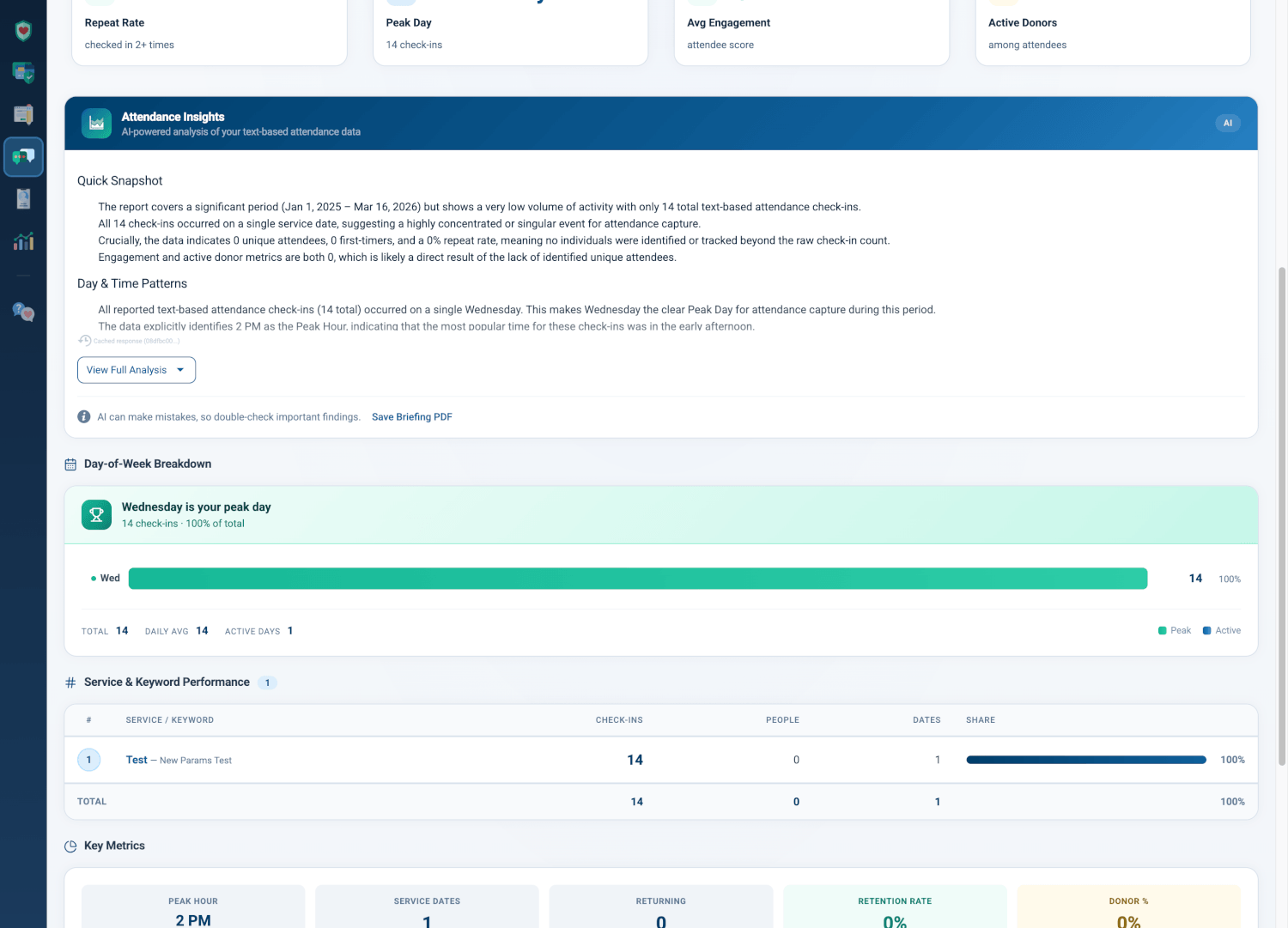
AI-Powered Attendance Insights Written for You
Below the snapshot cards, an Attendance Insights panel analyzes your check-in data and writes a plain-language briefing you can share with your leadership team. It examines your day-of-week patterns, peak hours, keyword performance, and retention trends — then tells you what’s going well, what needs attention, and what to do next.
The analysis is written for pastors, not statisticians. Need to present at a board meeting? Click Save Briefing PDF and you have a clean, one-page summary ready to print or email.
Why it matters: Instead of staring at a chart wondering “Is our Wednesday check-in growing?”, the AI tells you: “Wednesday is your busiest day with 68% of all check-ins. Consider promoting your midweek service keyword during Sunday announcements to capture even more attendees.” That’s the kind of specific, actionable insight that helps you make better decisions for your congregation.
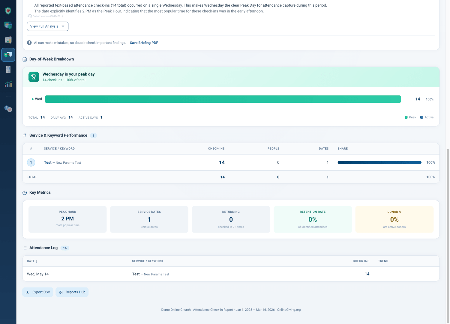
See Your Busiest Day Instantly
The Day-of-Week Breakdown shows your check-in distribution as a clean horizontal bar chart. Your peak day is highlighted in green with a trophy banner at the top, so you never have to guess which service draws the most text check-ins. Every day shows its count, its percentage of total check-ins, and a proportional bar so you can compare at a glance.
A summary row at the bottom shows your total check-ins, daily average, and the number of active days — giving you the context you need to understand the full week.
Why it matters: Maybe Sunday morning feels packed, but the data shows your Wednesday evening service is actually growing faster. Or maybe you’re running attendance keywords for five different services but only two are getting real traction. The day-of-week view makes the answer obvious in one glance — so you can double down on what’s working and rethink what isn’t.
Which Keywords Are People Texting?
The Service & Keyword Performance table ranks your attendance keywords by total check-ins. Each row shows the keyword, how many check-ins it captured, how many unique people used it, how many service dates it was active on, and its share of total check-ins with a visual bar.
You can customize your attendance keywords right at the top of the report. The chip bar shows every keyword the report uses to identify check-in conversations. Need to add a new one? Just type it and press Enter. Need to remove one that’s no longer relevant? Click the X. Changes take effect immediately.
Why it matters: If you’re running “checkin” for Sunday morning and “attendance” for Wednesday night, this table tells you exactly how each keyword is performing. Maybe “checkin” captures 80% of your check-ins while “headcount” gets almost none — now you know which keywords to promote and which to retire.
Retention, First-Timers, and the People Who Keep Coming Back
The Key Metrics strip at the bottom of the report answers the questions every pastor cares about most: Are people coming back? How many are new? What’s our retention rate?
You see your Peak Hour (the most popular check-in time), Service Dates (how many unique dates had check-ins), Returning (people who checked in more than once), Retention Rate (the percentage who came back), and if giving data is available, the percentage of your attendees who are Active Donors.
Why it matters: A growing check-in count feels great — but are those the same 50 people every week, or are you reaching new families? The first-timer and retention metrics answer that question definitively. If your repeat rate is climbing, your congregation is sticking. If first-timers are surging but retention is flat, it’s time to strengthen your follow-up process.
Every Check-In, Sorted and Searchable
The Attendance Log table at the bottom shows every check-in event in your selected date range — date, service keyword, check-in count, and trend. Click any column header to sort ascending or descending. Need the raw data? Click Export CSV to download everything into a spreadsheet.
Export, Print, and Schedule Automatic Delivery
The Attendance Check-In report gives you multiple ways to share and stay informed:
- Export CSV downloads every check-in record into a spreadsheet for further analysis or record-keeping
- Save as PDF creates a professional PDF of the entire report, branded with your organization’s logo
- Briefing PDF exports just the AI analysis for a quick leadership summary
- Print sends the report to your printer with clean, print-optimized formatting
- Email Scheduling lets you configure automatic report delivery — weekly, monthly, or annually — so the right people always have the latest attendance numbers
Why it matters: Schedule a weekly attendance email to your campus pastors every Monday morning, and they’ll start the week knowing exactly how last week’s check-ins looked — without anyone having to remember to pull the report.
At a Glance
- 8 attendance snapshot cards: See total check-ins, first-timers, repeat rate, peak day, and engagement in one view
- AI Attendance Insights: Plain-language analysis and recommendations tailored to your actual attendance data
- Day-of-week breakdown: Know instantly which day draws the most check-ins and spot weekly patterns
- Keyword performance rankings: See which text keywords capture the most check-ins and which need attention
- First-timer and retention tracking: Know how many new faces walked through the door and how many keep coming back
- Customizable attendance keywords: Add or remove keywords that define what counts as a check-in for your church
- Campus filtering: Multi-campus churches can compare attendance across locations
- Automated email delivery: Schedule weekly, monthly, or annual report emails to campus pastors and leadership
- CSV, PDF, and print export: Board-ready exports and spreadsheet downloads for record-keeping and presentations
Try It Now
- Go to Text Marketing > Reports in your left sidebar and click the Attendance Check-In card
- Select Last Month to see your most recent month of text-based attendance, then review the At a Glance cards and Day-of-Week Breakdown
- Scroll down to the Service & Keyword Performance table to see which keywords are capturing the most check-ins — and try adding a new keyword in the chip bar at the top of the report