Feature Updates 05/19/2025
Updated Look and Feel for Text Giving & Guest Text Giving
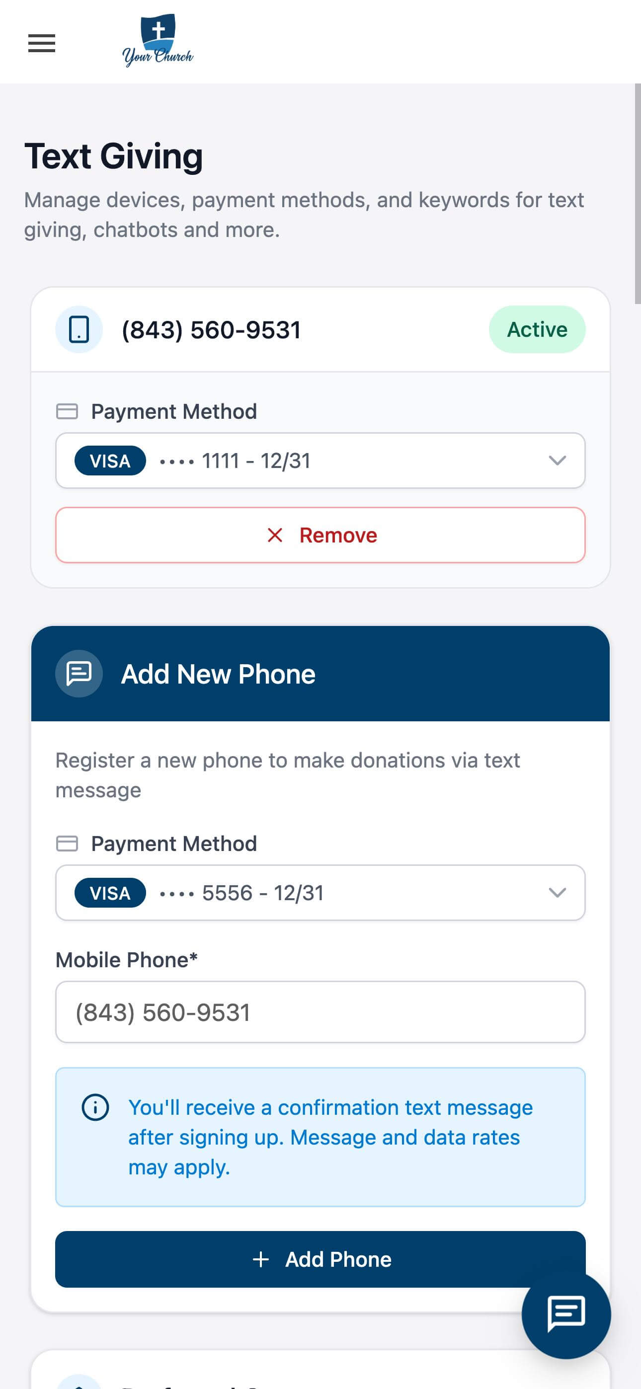
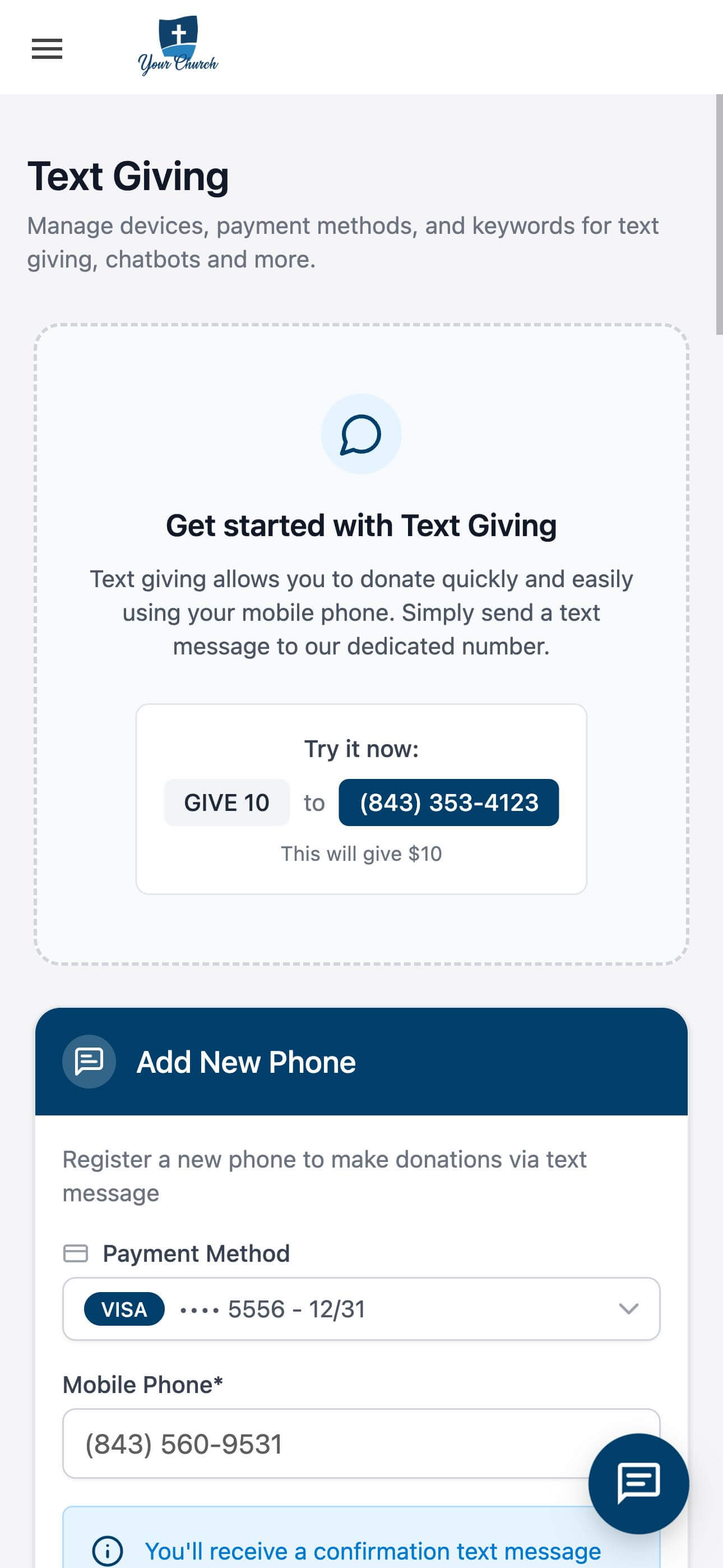
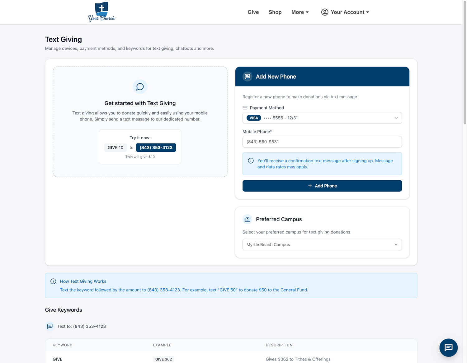
We’ve rolled out a refreshed visual design for the Text Giving and Guest Text Giving experiences at OnlineGiving.org. While the platform has always emphasized clean, mobile-first usability, this update introduces a modernized aesthetic that enhances clarity, usability, and visual confidence across all devices.
What’s New in the Interface
1. Modern Visual Styling
The interface now features a more contemporary design language—updated fonts, refined spacing, cleaner borders, and a more neutral color palette that creates a polished and cohesive experience without overwhelming users.
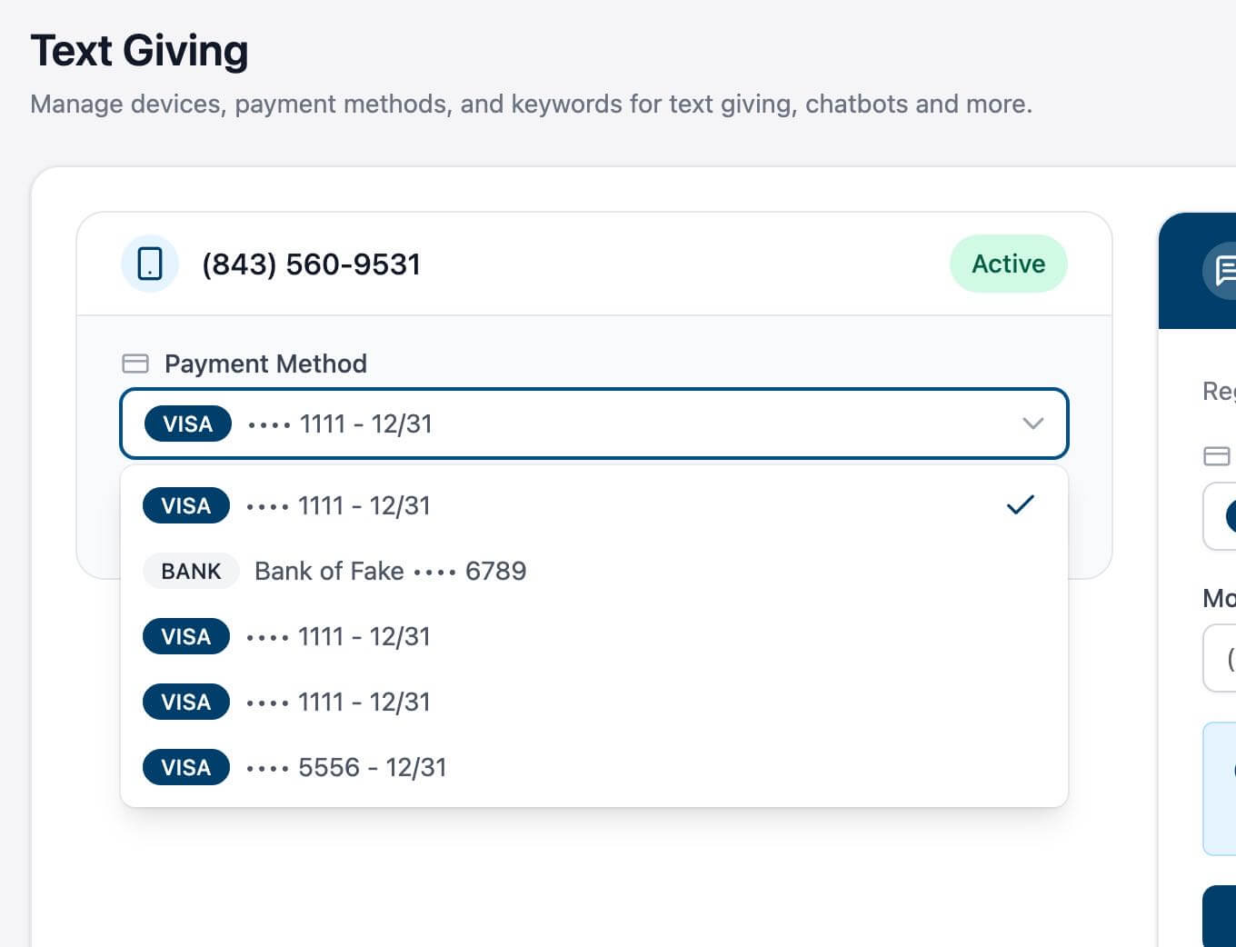
2. Updated Payment Method Selector
The dropdown for selecting payment methods has been redesigned with:
-
Clearer card styles and iconography for Visa, bank accounts, etc.
-
Masked payment details and expiration dates that are easier to read
-
Visually defined active selections to reduce friction
3. Simplified Phone Linking Workflow
The process for registering a new mobile phone number has been visually improved, making each step clearer and more intuitive—without adding complexity.
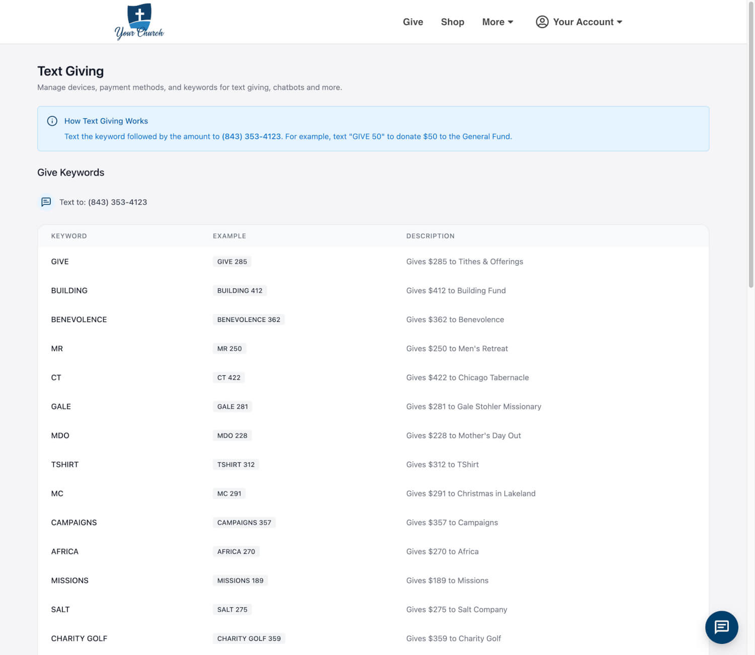
4. Enhanced Keyword Discovery
The keyword table has been restyled for faster scanning and better readability. Clearer headers, aligned columns, and consistent spacing help users quickly find the correct code for their intended donation.
5. Improved Status and Interaction Feedback
Interactive elements such as dropdowns, buttons, and status indicators now feature subtle enhancements that improve visual hierarchy and reduce cognitive load, particularly on smaller screens.
Available Now
These UI updates are now live. Log in as a donor to explore the new look and enjoy a more refined giving experience.
 |
 |
 |
 |
 |
 |